Difference between revisions of "Matlab Plotting"
m (→Title and Axis Labels) |
m (→Basics) |
||
| Line 19: | Line 19: | ||
Here '''a''' represents the color to use when plotting this function, '''b''' represents the type of symbol to use (dots, squares, etc), and '''c''' represents the style of the line to use (solid, dashed, etc). The following three tables describe what to insert for '''a''', '''b''' and '''c''' to control plot styles. | Here '''a''' represents the color to use when plotting this function, '''b''' represents the type of symbol to use (dots, squares, etc), and '''c''' represents the style of the line to use (solid, dashed, etc). The following three tables describe what to insert for '''a''', '''b''' and '''c''' to control plot styles. | ||
| − | {| border="1" cellpadding="5" cellspacing="0" align="center" style="text-align: | + | {| border="1" cellpadding="5" cellspacing="0" align="center" style="text-align:center" |
|+ '''Line & Symbol Colors''' | |+ '''Line & Symbol Colors''' | ||
|- | |- | ||
| Line 35: | Line 35: | ||
| − | {| border="1" cellpadding=" | + | {| border="1" cellpadding="3" cellspacing="0" align="center" style="text-align:center" |
|+ '''Line Markers''' | |+ '''Line Markers''' | ||
|- | |- | ||
| Line 50: | Line 50: | ||
| − | {| border="1" cellpadding="5" cellspacing="0" align="center" style="text-align: | + | {| border="1" cellpadding="5" cellspacing="0" align="center" style="text-align:center" |
|+ '''Line Styles''' | |+ '''Line Styles''' | ||
|- | |- | ||
Revision as of 13:38, 24 August 2008
|
Contents
X-Y Line Plots
Perhaps the most common plots we create as engineers are x-y line plots that show the functional dependence of one variable (y) on another (x). In MATLAB, an x-y plot is very simple to make. For example, if we want to plot  on the interval (-π,π) we can do this simply as
   x = linspace(-pi,pi);  % create the x vector
   plot(x,cos(x));        % plot cos(x) versus x.
Basics
The basic syntax for plotting a function is the following
   plot( x, y );       % simplest way to plot a single function
   plot( x, y, 'abc'); % controls the line style
Here a represents the color to use when plotting this function, b represents the type of symbol to use (dots, squares, etc), and c represents the style of the line to use (solid, dashed, etc). The following three tables describe what to insert for a, b and c to control plot styles.
| Symbol | b | g | r | c | m | y | k | w | |
|---|---|---|---|---|---|---|---|---|---|
| Color | Blue | Green | Red | Cyan | Magenta | Yellow | Black | white | Default color |
| Symbol | . | o | x | + | * | s | d | ^ | v | < | > | p | h | |
|---|---|---|---|---|---|---|---|---|---|---|---|---|---|---|
| Description | Point | Circle | x | plus | star | Square | Diamond | Triangle (up) | Triangle (down) | Triangle (left) | Triangle (right) | Pentagon | Hexagon | No Symbol |
| Symbol | - | : | .- | -- | |
|---|---|---|---|---|---|
| Description | Solid | Dotted | Dot-Dash | Dashed | No line |
The following are some examples of creating plots
   x = linspace(-pi,pi);    % create 100 points between -pi and pi
   y = sin(x) .* cos(x);    % evaluate a function at each point
   plot(x,y,'rs:');         % plot a red dotted line with squares
   figure; plot(x,y,'g--'); % plot a green dashed line
   figure; plot(x,y,'ko');  % plot black circles (no line)
Note that the figure command creates a new plotting window. If you leave it out, the next plot will be overwritten.
Title and Axis Labels
Any time you create a plot, you must also label it! Axis labels (with units where appropriate) are critical. To create a title and label axes a plot in MATLAB, we use the following:
  xlabel('label text');
  ylabel('label text');
  title('title text');
| Text | \Lambda | \Xi | \Pi | \Sigma | \Theta | \Psi | \Omega | \alpha | \beta | \gamma | \delta | \epsilon | \eta | \theta |
|---|---|---|---|---|---|---|---|---|---|---|---|---|---|---|
| Symbol | Λ | Ξ | Π | Σ | Θ | Ψ | Ω | α | β | γ | δ | ε | η | θ |
Example:
   x=linspace(-pi,pi);
   plot(x,cos(x),'r--');
   xlabel('\theta');
   ylabel('cos(\theta)');
   title('A plot of the function cos(\theta) as a function of \theta');
Multiple Lines on a Graph
We often want to place multiple lines on a single plot. For example, if we want to plot the functions

on the interval (-π,π) we could do the following
   x = linspace(-pi,pi);
   f1 = cos(x);
   f2 = sin(x);
   plot(x,f1, x,f2);
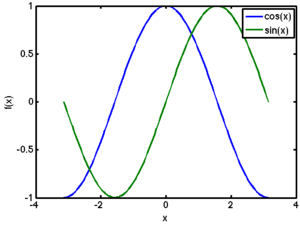
Here MATLAB automatically selects the colors for the lines. If we want more control over line styles, we can specify them ourselves:
plot(x,f1,'k-', x, f2, 'r:');
The hold on command
   x = linspace(-pi,pi);
   f1 = cos(x);
   f2 = sin(x);
   plot(x,f1,'k-');
   hold on;
   plot(x,f2,'r:');
   hold off;
Adding a Legend
When we have multiple lines on a single plot, we should add a legend to describe each line. The legend command can be used for this purpose. Its syntax is
legend('entry 1', 'entry2', ... 'entry n');
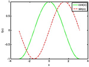
Continuing with our previous example, we would have something like
| MATLAB Source | Resulting Plot |
|---|---|
% Manually control the line styles.
x = linspace(-pi,pi);
f1 = cos(x);
f2 = sin(x);
plot(x,f1,'g-', x, f2, 'r--');
xlabel('x'); ylabel('f(x)');
legend('cos(x)','sin(x)');
|
|
% Use MATLAB's default line styles.
x = linspace(-pi,pi);
f1 = cos(x);
f2 = sin(x);
plot(x,f1, x,f2);
xlabel('x'); ylabel('f(x)');
legend('cos(x)','sin(x)');
|
Log-Scale Plots
- semilogx
- semilogy
- loglog
Subplots
Fine-Tuning
- Adding a grid
- Changing axis ranges

