Matlab Plotting
Contents
X-Y Line Plots
Perhaps the most common plots we create as engineers are x-y line plots that show the functional dependence of one variable (y) on another (x). In MATLAB, an x-y plot is very simple to make. For example, if we want to plot  on the interval (-π,π) we can do this simply as
   x = linspace(-pi,pi);  % create the x vector
   plot(x,cos(x));        % plot cos(x) versus x.
Basics
The basic syntax for plotting a function is the following
   plot( x, y );       % simplest way to plot a single function
   plot( x, y, 'abc'); % controls the line style
Here a represents the color to use when plotting this function, b represents the type of symbol to use (dots, squares, etc), and c represents the style of the line to use (solid, dashed, etc). The following three tables describe what to insert for a, b and c to control plot styles.
| Symbol | b | g | r | c | m | y | k | w | |
|---|---|---|---|---|---|---|---|---|---|
| Color | Blue | Green | Red | Cyan | Magenta | Yellow | Black | white | Default color |
| Symbol | . | o | x | + | * | s | d | ^ | v | < | > | p | h | |
|---|---|---|---|---|---|---|---|---|---|---|---|---|---|---|
| Description | Point | Circle | x | plus | star | Square | Diamond | Triangle (up) | Triangle (down) | Triangle (left) | Triangle (right) | Pentagon | Hexagon | No Symbol |
| Symbol | - | : | .- | -- | |
|---|---|---|---|---|---|
| Description | Solid | Dotted | Dot-Dash | Dashed | No line |
The following are some examples of creating plots
   x = linspace(-pi,pi);    % create 100 points between -pi and pi
   y = sin(x) .* cos(x);    % evaluate a function at each point
   plot(x,y,'rs:');         % plot a red dotted line with squares
   figure; plot(x,y,'g--'); % plot a green dashed line
   figure; plot(x,y,'ko');  % plot black circles (no line)
Note that the figure command creates a new plotting window. If you leave it out, the next plot will be overwritten.
Title and Axis Labels
Any time you create a plot, you must also label it! Axis labels (with units where appropriate) are critical. To create a title and label axes a plot in MATLAB, we use the following:
  xlabel('label text');
  ylabel('label text');
  title('title text');
| Text | \Lambda | \Xi | \Pi | \Sigma | \Theta | \Psi | \Omega | \alpha | \beta | \gamma | \delta | \epsilon | \eta | \theta |
|---|---|---|---|---|---|---|---|---|---|---|---|---|---|---|
| Symbol | Λ | Ξ | Π | Σ | Θ | Ψ | Ω | α | β | γ | δ | ε | η | θ |
Example:
   x=linspace(-pi,pi);
   plot(x,cos(x),'r--');
   xlabel('\theta');
   ylabel('cos(\theta)');
   title('A plot of the function cos(\theta) as a function of \theta');
Multiple Lines on a Graph
We often want to place multiple lines on a single plot. For example, if we want to plot the functions

on the interval (-π,π) we could do the following
   x = linspace(-pi,pi);
   f1 = cos(x);
   f2 = sin(x);
   plot(x,f1, x,f2);
Here MATLAB automatically selects the colors for the lines. If we want more control over line styles, we can specify them ourselves:
plot(x,f1,'k-', x, f2, 'r:');
The hold on command
   x = linspace(-pi,pi);
   f1 = cos(x);
   f2 = sin(x);
   plot(x,f1,'k-');
   hold on;
   plot(x,f2,'r:');
   hold off;
Adding a Legend
When we have multiple lines on a single plot, we should add a legend to describe each line. The legend command can be used for this purpose. Its syntax is
legend('entry 1', 'entry2', ... 'entry n');
Continuing with our previous example, we would have something like
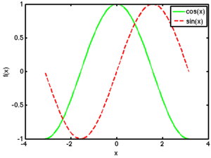
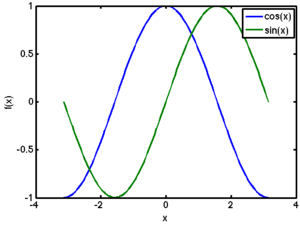
| MATLAB Source | Resulting Plot |
|---|---|
% Manually control the line styles.
x = linspace(-pi,pi);
f1 = cos(x);
f2 = sin(x);
plot(x,f1,'g-', x, f2, 'r--');
xlabel('x'); ylabel('f(x)');
legend('cos(x)','sin(x)');
|
|
% Use MATLAB's default line styles.
x = linspace(-pi,pi);
f1 = cos(x);
f2 = sin(x);
plot(x,f1, x,f2);
xlabel('x'); ylabel('f(x)');
legend('cos(x)','sin(x)');
|
Log-Scale Plots
- semilogx
- semilogy
- loglog
Subplots
|
Fine-Tuning
- Adding a grid
- Changing axis ranges
|
Contour & Surface Plots
|
Histograms & Bar Graphs
|
Pie Charts
|

